
White trim is a popular choice for its crisp contrast with Repose Gray walls. Soft ivory or light beige also complements the versatile shade well.
Repose Gray is a warm and inviting neutral paint color from Sherwin-Williams, offering a perfect backdrop for various interior styles. Homeowners are often drawn to this adaptable hue due to its ability to pair seamlessly with a wide array of trim colors.
White trim, especially, stands out for its classic and timeless appeal, creating a clean and defined boundary that accentuates the sophistication of Repose Gray. For those preferring a softer palette, ivory or light beige trims offer a smooth transition, enhancing the cozy ambiance of a room. The choice of trim color can dramatically transform the space, either by providing a sharp contrast with crisp white or ensuring a more blended feel with softer tones. Selecting the right trim color is key to achieving the desired ambiance and aesthetic harmony in any Repose Gray painted room.
Introduction To Repose Gray
Repose Gray is a warm, neutral paint color that offers unmatched versatility for interior walls. Its ability to serve as a transitional shade makes it a top choice for designers and homeowners alike. The right trim color can enhance Repose Gray’s soothing qualities, creating a cohesive and inviting atmosphere within any space.
Trim plays a pivotal role in bringing a room’s color scheme together, acting as a frame for the wall color. Selecting the appropriate trim color for Repose Gray walls is essential to highlight their subtle undertones and accentuate the wall’s gray hues. A proper trim choice ensures a balanced visual appeal and harmonizes with the overall aesthetic of a room.
Classic Trim Choices For Repose Gray
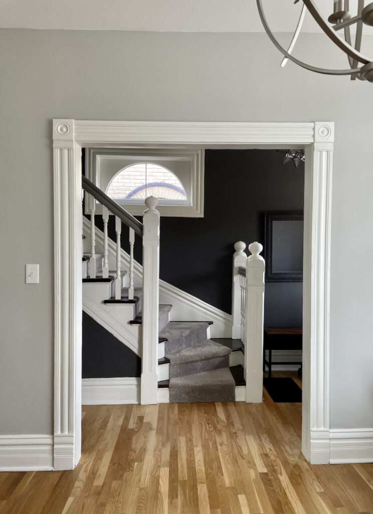
Bright White creates a striking contrast when paired with Repose Gray walls. This classic combination allows for a vibrant yet elegant separation, highlighting architectural details and offering a crisp finish to spaces. It’s a popular choice amongst designers seeking to establish a clean and inviting atmosphere.
Off-white or Cream trim can introduce a warmer tone, resulting in a cozier ambiance. This palette choice softens the transition between wall and trim, bringing a more subtle contrast compared to bright white. It’s ideal for those desiring a more relaxed and harmonious interior.
Choosing Matching Repose Gray for both walls and trim can create a seamless and contemporary look. This approach is perfect for highlighting the simplicity and uniformity of a room, often making smaller spaces appear larger and more streamlined.
Bold And Innovative Trim Pairings
Charcoal or black trim can transform your Repose Gray walls with a sleek, modern twist. This bold contrast creates a definitive border that frames your living space with sophistication. Your home will carry an air of contemporary elegance, giving it a standout character.
Navy or deep blue trims bring a surprising depth to Repose Gray rooms. These hues sing with a subtle vibrancy, offering a cohesive look while still making a statement. The interplay between the cool gray and the rich blue provides a harmonious balance, perfect for a serene home environment.
| Trim Color | Visual Impact | Best Suited For |
|---|---|---|
| Charcoal/Black | Modern and Bold | Contemporary Spaces |
| Navy/Deep Blue | Depth and Serenity | Tranquil environments |
| Metallic | Luxurious and Chic | Elegant Settings |
Choosing metallic trims adds a dash of luxury. These trims capture light and add a refined sparkle to your decor. Whether it’s brushed nickel or soft gold, metallic accents around Repose Gray walls can elevate the aesthetic from simple to sumptuously sophisticated.
Credit: www.maisondepax.com
Considering Room Elements And Lighting
Natural light plays a pivotal role in highlighting the subtle undertones of Repose Gray walls and therefore influences the trim color choice. Bright, indirect sunlight can reveal cool hues, suggesting a crisp white trim to complement the walls. On the contrary, spaces with limited natural light might benefit from warmer trim shades, adding a cozy feel to the room.
Your furniture and decor are essential factors to consider as they can dictate the trim color that ties the room together. Opt for a trim color that creates a cohesive look with your furniture. A dark wood or bold-colored furniture piece can be accentuated with a contrasting lighter trim or harmonized with a richer, deeper trim shade.
The type and color temperature of artificial lighting significantly affect how paint colors are perceived. Cool LED lighting can enhance the gray tones, while warm lighting can soften them, making it crucial to select a trim color that maintains its integrity under different lighting scenarios. A versatile trim color that remains consistent in appearance under various light sources is ideal.
Application Tips For Repose Gray And Trim Colors
Preparation and Painting Techniques For a Professional Finish require meticulous attention to detail. Starting with a clean and smooth surface ensures trim paint adheres well. Using high-quality painter’s tape protects the Repose Gray walls, achieving sharp lines and professional aesthetics. Applying a primer before the final coat can significantly enhance the trim color against the muted backdrop of Repose Gray. Multiple thin coats often provide a better result than a single thick one, allowing for drying time between applications.
Balancing Satin, Gloss, and Matte Finishes is crucial. A semi-gloss or satin finish on trims can complement the softness of Repose Gray, imparting a subtle contrast without overwhelming. Selecting the appropriate sheen contributes not only to the visual appeal but also to the durability of the surfaces, with glossier finishes generally offering easier cleaning.
For Maintaining Color Consistency Across Different Surfaces, testing the chosen trim color in various lighting conditions is advisable. This strategy ensures that the trim color remains consistently paired with the Repose Gray despite changes in natural and artificial lighting. It’s essential to consider the undertones of both the trim and wall colors to maintain a harmonious palette throughout the space. Utilizing the same paint brand and finish across all surfaces may also help in preserving color uniformity.
Credit: thecolorconcierge.com
Credit: www.settingforfour.com
Frequently Asked Questions On What Color Trim Goes With Repose Gray Walls?
What Trim Colors Complement Repose Gray Walls?
White trim is a classic choice that complements Repose Gray walls beautifully. It creates a crisp, clean contrast that highlights the walls’ soft, warm tones. For a harmonious look, consider a bright, pure white or a softer off-white.
Can Dark Trim Work With Repose Gray Walls?
Yes, dark trim can create a bold and sophisticated contrast with Repose Gray walls. Options like charcoal or black bring a modern and dramatic effect, enhancing the wall color’s depth and making it stand out.
Are There Warm Trim Hues For Repose Gray?
Choosing a cream or beige trim can add warmth to Repose Gray walls. This subtle pairing is perfect for a cozy atmosphere, creating a seamless blend between the walls and trim.
Is Wood Trim A Good Match For Repose Gray?
Wood trim offers a natural, earthy complement to Repose Gray walls. Lighter woods like pine or oak can make the room feel airy, while darker woods like walnut or mahogany provide a rich, elegant contrast.
Conclusion
Choosing the perfect trim color for your Repose Gray walls need not be complex. Classic white offers a fresh, clean contrast, while darker hues create a bold statement. Remember, the right trim can showcase your style and complete your space.
Experiment and enjoy the transformation your choices bring to your home’s aesthetic.
